In an era where customer experience dictates footfall and social shareability drives free organic reach, physical spaces need more than traditional interior decor. They need a focal point.
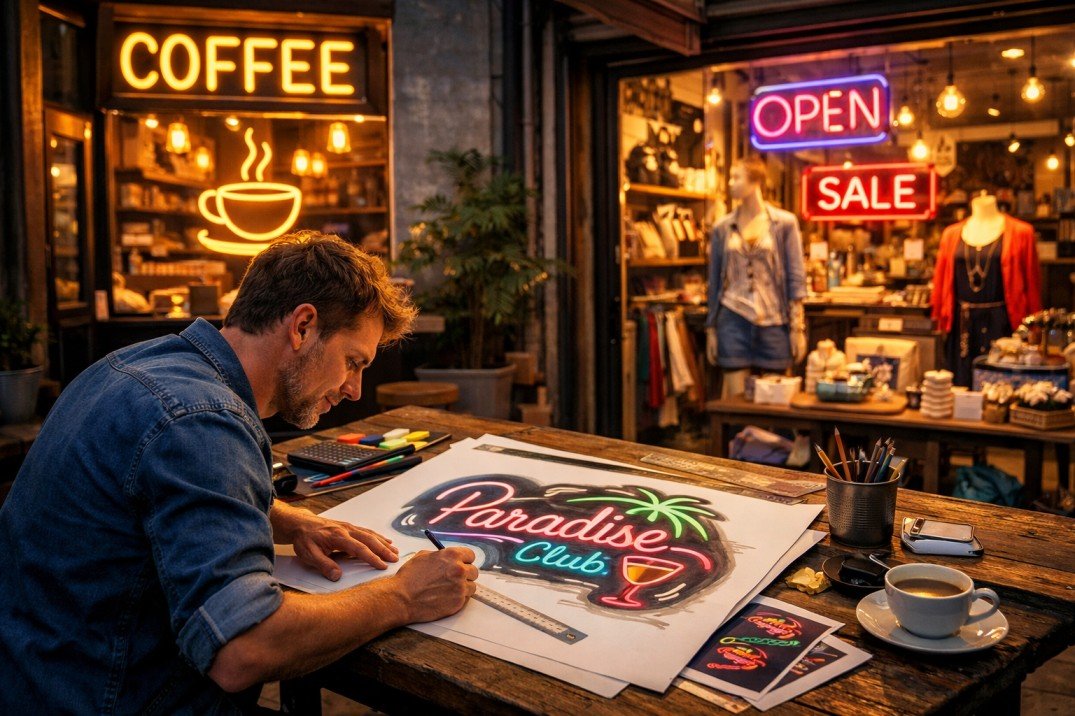
A custom neon sign does far more than illuminate a dark corner. In a cozy coffee shop, it creates an intimate, warm glow that invites guests to linger. In a bustling cocktail bar or restaurant, it sets the mood and serves as an irresistible photo backdrop. In retail boutiques, it directs foot traffic and reinforces brand recall right at the point of sale.
However, designing an effective commercial neon sign requires balancing aesthetics with structural fabrication, ambient lighting calculations, and legibility. Here is an architectural and branding guide to designing custom neon signs that elevate your commercial venue.
1. Traditional Glass Neon vs. Modern LED Neon Flex: What Commercial Spaces Need
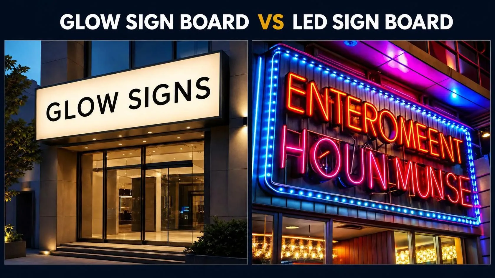
Before diving into typography and color palettes, it is essential to understand the material foundation. While traditional hand-blown glass neon established the vintage aesthetic, LED Neon Flex has largely replaced it in commercial architecture and hospitality.
| Feature | Traditional Glass Neon | Commercial LED Neon Flex |
| Durability | Fragile glass, breakable on impact | Shatterproof silicone/PVC tubing |
| Operating Voltage | High voltage (3,000V – 15,000V) | Low voltage (12V or 24V DC) |
| Energy Consumption | High electrical draw | Up to 70–80% lower power consumption |
| Heat Emission | Emits noticeable ambient warmth | Remains cool to the touch |
| Maintenance | Complex gas refills, high repair costs | Low maintenance, modular LED lifespan (50,000+ hrs) |
| Safety in Crowds | Risky near patrons and low ceilings | Completely safe for high-contact hospitality zones |
For cafes, high-turnover dining rooms, and interactive retail environments, LED Neon mounted on precision-cut acrylic backings provides the classic luminescence with zero safety or operational liabilities.
2. Defining the Sign’s Purpose: Logo, Tagline, or Photo Backdrop?
A common design mistake is attempting to make a single sign do everything. Before drafting artwork, categorize your sign into one of three core functions:
A. The Primary Brand Anchor
-
Placement: Exterior storefront, entrance foyer, or behind the reception/billing counter.
-
Design Goal: Immediate brand identification and professionalism.
-
Rule: Strict adherence to your vector logo, brand mark, or established brand typography.
B. The Experiential Photo Backdrop ("The Instagram Magnet")
-
Placement: Feature accent walls, botanical/foliage backdrops, or dedicated lounge seating.
-
Design Goal: User-generated content (UGC) and organic social media tags.
-
Rule: Use short, catchy, emotional, or quirky taglines (e.g., "Espresso Yourself", "Good Vibes Only", or a signature brand motto) sized perfectly for phone camera frames.
C. Atmospheric & Wayfinding Elements
-
Placement: Cocktail bars, restrooms, order counters, or retail changing rooms.
-
Design Goal: Subtle mood setting and functional direction without cluttering walls.
-
Rule: Minimalist line art, iconography (e.g., coffee cup, cocktail glass), or short directional words.
3. Typography & Legibility: Making Script Glow Without Glare
In graphic design, thin hairline fonts look elegant on a screen, but light expands when emitted. Neon light radiates outward, meaning tightly kerned letters or intricate serif fonts can blur into an unreadable blob when illuminated.
-
Prioritize Open Counters and Wide Kerning: Ensure circular loops (like e, a, o, g) have sufficient negative space so the light does not bleed across letterforms.
-
Choose Continuous Script or Clean Sans-Serif: Cursive and script fonts work naturally because neon tubing flows seamlessly from letter to letter. For bold modern aesthetics, block sans-serif fonts deliver high impact from across a large hall.
-
Minimum Stroke Thickness: Commercial LED flex profiles typically range between 6mm to 12mm in stroke width. Avoid vector details thinner than the minimum bending radius of the neon tube to prevent distorted lines.
4. Selecting the Right Color Temperature for Hospitality vs. Retail
Color does not just deliver branding—it establishes psychological ambiance and influences consumer behavior:
-
Warm White (2700K – 3000K) & Amber: The gold standard for artisanal cafes, bakeries, and fine-dining spaces. It creates an inviting, relaxed atmosphere that complements warm wood, exposed brick, and low-light dining.
-
Cool White (6000K) & Crisp Pastels (Soft Pink, Mint): Ideal for modern retail boutiques, beauty salons, and contemporary fashion outlets where product colors must appear crisp, modern, and clean.
-
High-Saturates (Electric Pink, Cobalt Blue, Crimson Red): Perfect for craft cocktail bars, nightlife venues, streetwear outlets, and entertainment zones where bold contrast and high energy are required.
Pro Tip on Dimming: Always equip commercial neon signs with an inline dimmer controller. A sign calibrated for broad daylight visibility can easily blind customers sitting nearby during evening dinner hours.
5. Architectural Scale, Height, and Placement Guidelines
Scaling a sign incorrectly is the fastest way to ruin an interior design layout. Use these site-planning metrics:
-
The 60/40 Feature Wall Rule: A statement neon sign should occupy roughly 50% to 65% of the horizontal width of the wall or foliage grid it occupies. A sign that is too small looks like an afterthought, while one that touches doorframes or ceiling coves feels crowded.
-
Eye-Level Installation for Photo Ops: If the sign is intended for selfies and portraits, position the vertical center of the sign between 5.5 feet and 6.2 feet (165 cm – 190 cm) above the finished floor level so it frames naturally behind seated or standing patrons.
-
Viewing Distance Calculation: As a baseline rule of thumb, allow 1 inch of letter height for every 10 feet of clear viewing distance. For a cafe sign readable from 30 feet away, letters should stand at least 3 to 4 inches tall.
6. Acrylic Backing Techniques: Clear, Cut-to-Shape, or Box Mount?
The backing plate holds the neon channels and houses the low-voltage circuitry. Selecting the right cut changes how the sign integrates into your wall:
-
Cut to Shape (Contour Cut): The acrylic is CNC-machined along the exact curves of the neon letters with a small offset margin. This provides the most seamless look on textured walls, brickwork, or moss backgrounds.
-
Cut to Letter (Individual Letters): Each word or letter cluster has its own independent backing. Ideal for high-end luxury interiors where visible acrylic must be minimized.
-
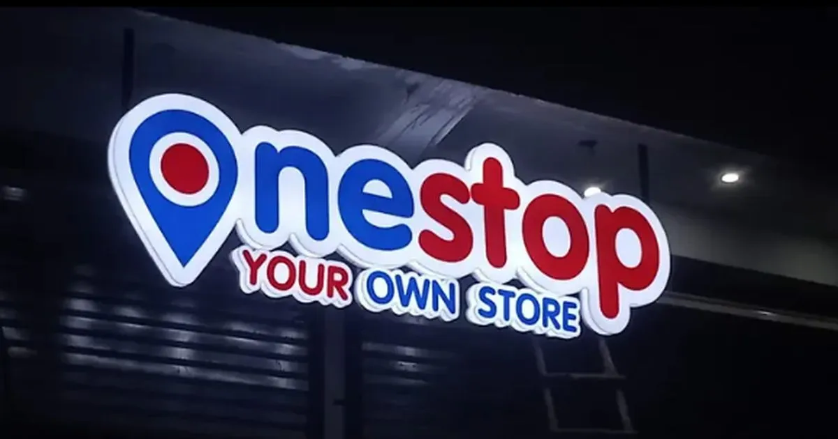
Solid Acrylic Rectangle / Backlit Box: Used when the neon is part of a larger branded plaque, or when contrasting acrylic colors (such as smoked black or frosted white) are required to make the colors pop against busy wallpaper.
7. Commercial Electrical and Installation Checklist
Commercial interiors cannot afford dangling cables, flickering adapters, or fire inspection hazards. When manufacturing your custom neon sign, ensure your signage partner adheres to industrial standards:
-
Concealed Wiring: Plan power conduit outlets directly behind the intended sign mount location before finishing drywall or millwork.
-
Industrial Transformers (Mean Well / IP67 Drivers): Power your signs with commercial-grade step-down drivers with overload, short-circuit, and thermal protection rather than cheap plug-and-play desktop adapters.
-
Outdoor Weatherproofing: If the sign is intended for an exterior facade or semi-open alfresco patio, specify IP65 or IP67 waterproof silicone casings with sealed end-caps to prevent moisture ingress.
Frequently Asked Questions (FAQ)
What is the lifespan of an LED neon sign in a commercial cafe or restaurant?
High-grade commercial LED neon flex signs generally boast an operating lifespan of 40,000 to 50,000+ hours. If operated 12 hours a day, a well-fabricated sign will run reliably for 8 to 10+ years with negligible maintenance.
How much power does a commercial custom neon sign consume?
A medium-sized LED neon sign (approx. 3 to 4 feet in length) typically draws between 30W and 70W of electricity—less than an ordinary incandescent ceiling fixture. This translates to very low operating expenses on monthly utility bills.
Can custom neon signs replicate intricate brand logos?
Yes. Modern CNC acrylic engraving combined with mini-flex LED tubing allows fabricators to follow detailed vector contours, script logos, and intricate graphic emblems. For extremely minute graphic details, hybrid fabrication (combining UV printed acrylic with neon borders) delivers unmatched fidelity.
Build Your Signature Glow with Artroot Signages
A memorable commercial space is built on unforgettable details. Whether launching a new flagship cafe, redesigning a restaurant lounge, or establishing a multi-city retail footprint, your signage must reflect the quality of your brand.
At Artroot Signages, we fabricate premium, tailor-made commercial signage in-house. From high-precision CNC acrylic shaping to commercial-grade LED neon flex wiring and structural on-site installation, our team manages the entire process from concept to delivery.
Ready to illuminate your commercial space?
👉 Explore our Custom Neon Signs Collection or contact our design engineers for a custom mock-up and site consultation.